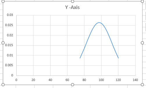
A bell curve, also known as a normal distribution curve, is a powerful visualization tool for analyzing and presenting data. Excel offers the capability to create a bell curve, allowing you to explore and understand the distribution of your data effectively. In this comprehensive tutorial, we will walk you through the step-by-step process of creating a bell curve in Excel, complete with examples and sample data.
Understanding the Bell Curve
Before we dive into creating a bell curve, it’s essential to understand what it represents. A bell curve is a graphical representation of a normal distribution, where data is symmetrically distributed around the mean, forming a shape that resembles a bell. This distribution is characterized by its mean and standard deviation.
Step 1: Prepare Your Data
To create a bell curve, you’ll need a dataset that follows a normal distribution. If you don’t have one, you can generate sample data for practice. For instance, you might collect exam scores from a group of students.
Step 2: Calculate Mean and Standard Deviation
Before plotting the bell curve, you need to calculate the mean (average) and standard deviation of your dataset. You can do this using Excel’s built-in functions, such as AVERAGE and STDEV.
Step 3: Set Up the Bell Curve Chart
Here’s how to create a bell curve chart:
Create a column with a range of values around the mean. These will be the x-values on your bell curve. You can use a sequence of numbers or use the
NORM.INVfunction to calculate them.In another column, calculate the corresponding y-values using the normal distribution formula. For example,
=NORM.DIST(A2, mean, stdev, FALSE).Select your x and y-values data.
Go to the “Insert” tab and choose “Scatter” under the Charts group.
Select “Scatter with Straight Lines.”
This will create a basic bell curve chart.
Step 4: Customize the Chart
To make your bell curve visually appealing and informative, you can customize it in various ways:
- Add labels to the axes, title, and legend.
- Change the line style, color, and markers.
- Adjust axis scales.
- Add gridlines for clarity.
Step 5: Interpret and Analyze the Bell Curve
Once you’ve created the bell curve, you can analyze your data. For example, you can find the probability of an observation falling within a specific range by calculating the area under the curve.
Examples with Sample Data
Example 1: Exam Scores
Imagine you’re a teacher, and you want to visualize how the exam scores of your students are distributed. Creating a bell curve can help you understand the typical score range and identify exceptional performances.
Step 1: Prepare Your Data
-
Open Excel: Launch Excel on your computer.
-
Create a New Worksheet: Start by opening a new worksheet.
-
Enter Your Data: In the first column (let’s say column A), enter your exam scores. You can use any numbers you like, but let’s use the following sample scores:
- 75
- 80
- 85
- 90
- 95
- 100
- 105
- 110
- 115
- 120
-
Calculate the Mean and Standard Deviation: In an empty cell (let’s say cell B1), calculate the mean of the scores using the formula
=AVERAGE(A1:A10). In another cell (let’s say B2), calculate the standard deviation with=STDEV(A1:A10).
Step 2: Set Up the Bell Curve Chart
Now, let’s create the bell curve chart:
-
Generate X-Values: In column C, create a sequence of numbers around the mean (B1). You can start from a value slightly below the mean (e.g., 70) and increment by small steps (e.g., 2). Your sequence could be like: 70, 72, 74, 76, … and so on. Drag the fill handle (a small square at the lower-right corner of the cell) down to create a list of X-values.
-
Calculate Y-Values: In the adjacent column (column D), calculate the corresponding Y-values using the normal distribution formula. In cell D1, enter
=NORM.DIST(C1, $B$1, $B$2, FALSE), and then copy this formula down to fill the column. This formula calculates the probability density of each X-value based on the mean and standard deviation. -
Select Your Data: Click and drag to select both columns C and D. These will be the data for your bell curve.
-
Create a Scatter Plot: Go to the “Insert” tab in the Excel ribbon, click “Scatter,” and select “Scatter with Straight Lines.”
Step 3: Customize the Chart
You can make your chart look better by customizing it:
-
Add Labels: Click on the chart, go to “Chart Elements” (the plus icon), and add titles and axis labels.
-
Adjust Line Style: Right-click on the curve, choose “Format Data Series,” and adjust line styles, colors, and markers to your preference.
-
Adjust Axis Scales: Right-click on the axes and format them. For the X-axis, you can start from a value below the minimum X-value and end with a value above the maximum X-value.
Step 4: Interpret and Analyze
Now that you have your bell curve chart, you can analyze your data. For instance, you can find the probability of a student scoring within a specific range by looking at the area under the curve.
In this example, you’ve created a bell curve to visualize the distribution of exam scores in your class. This technique can be valuable for understanding your students’ performance and making data-driven decisions.

Example 2: Employee Performance Ratings
Imagine you have employee performance ratings, and you want to analyze the distribution of ratings in your organization. By calculating the mean and standard deviation and creating a bell curve chart, you can gain insights into your employees’ performance.
Conclusion
In conclusion, creating a bell curve in Excel is a valuable skill for data analysis and visualization. This comprehensive guide, along with practical examples and sample data, equips you with the knowledge and tools to effectively represent and analyze data using a bell curve.
