
Introduction
In this easy-to-follow Excel tutorial, we will guide you through the process of creating a line chart. Line charts are a powerful tool for visualizing trends, patterns, and changes in data over time. Whether you’re a student, business professional, or data enthusiast, this step-by-step guide will help you master the art of crafting compelling line charts in Excel. We’ll also explore related topics commonly found in Google search autocomplete suggestions.
What Is a Line Chart?
A line chart is a type of chart that uses connected line segments to visualize the relationship between two variables, typically time and value. Line charts are often used to show trends over time, but they can also be used to compare values across different categories.
Line charts are relatively easy to read and understand, which makes them a popular choice for data visualization. The horizontal axis of a line chart typically represents the independent variable, such as time or category. The vertical axis represents the dependent variable, such as value or quantity.
There are many different types of line charts, which can be customized to meet the specific needs of the data being visualized. Some common types of line charts include:
- Simple line charts: Simple line charts connect the data points with a single line.
- Stacked line charts: Stacked line charts stack the data points on top of each other to show the total value of each category.
- Percent stacked line charts: Percent stacked line charts show the percentage contribution of each category to the total value.
- Area charts: Area charts fill in the area under the line chart to show the cumulative value of the data.
Line charts can be used to visualize a wide variety of data, such as:
- Sales trends over time
- Customer satisfaction ratings over time
- Product performance across different regions
- Stock prices over time
- Weather data over time
Line charts are a versatile and powerful tool for data visualization. They can be used to communicate complex data in a clear and concise way.
Here are some examples of how line charts can be used in different contexts:
- A marketing team might use a line chart to track the sales of a new product over time.
- A customer support team might use a line chart to track customer satisfaction ratings over time.
- A product manager might use a line chart to compare the performance of different products in different regions.
- An investor might use a line chart to track the stock price of a company over time.
- A meteorologist might use a line chart to track the temperature over time in a given location.
Line charts are an essential tool for anyone who needs to communicate data in a clear and concise way.
Preparing Your Data
Proper data organization is key. Learn how to structure your data to create a meaningful line chart, and understand the importance of having clear categories and numerical values.
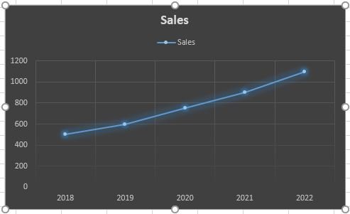
Example: Suppose you have data like this:
| Year | Sales |
|---|---|
| 2018 | 500 |
| 2019 | 600 |
| 2020 | 750 |
| 2021 | 900 |
| 2022 | 1100 |

How to Make a Line Graph in Excel
To make a line graph in Excel, follow these steps:
- Select the data that you want to plot in the graph.
- Click on the Insert tab and then click on the Line chart type.
- Select the line chart style that you want to use.
- The line graph will be created and inserted into your worksheet.
Steps: 1. Select the data range A1:B5.
2. Click on the Insert tab and then click on the Line chart type.
3. Select the line chart style that you want to use.
4. The line graph will be created and inserted into your worksheet.
Customizing Your Line Chart
Creating a basic line chart is just the beginning. To make your line chart more visually appealing and informative, you can customize various elements of the chart. Here are the steps and options for customizing your line chart in Excel:
a. Changing Chart Type: Excel provides various line chart types. To change the chart type or add additional data series, right-click the chart and select “Change Chart Type.” You can experiment with options like stacked line charts, 3D lines, and more to suit your data representation needs.
b. Modifying Line Styles: You can change the line style for each data series. Click on the line to select it, right-click, and choose “Format Data Series.” Here, you can adjust the line color, thickness, and style.
c. Adding Markers: Markers are data points that help highlight specific values in your chart. To add markers to your line chart, select a data series, right-click, and go to “Format Data Series.” From there, you can choose marker options, such as type, size, and fill color.
Example: If you want to emphasize the data points in your line chart, you can select “Marker Options” and choose a different shape, size, or fill color for your data points.
d. Customizing Axes: To change the appearance of your chart’s axes, select the chart area and then right-click to format it. You can modify axis scales, add or remove gridlines, and choose custom axis labels.
e. Adjusting Legends: If your chart has multiple data series, the legend helps identify which line represents what. You can customize the legend’s position, font size, and other formatting options by right-clicking the legend and selecting “Format Legend.”
f. Enhancing Data Labels: Data labels provide direct insight into data points on your chart. You can customize data labels to show values, percentages, or other information. Select the data series, right-click, and choose “Add Data Labels.”
Example: You can display the exact sales values on your line chart next to data points by adding data labels.
g. Applying Chart Layouts: Excel offers various chart layouts to give your chart a polished look. You can access these by selecting the chart and navigating to the “Chart Design” tab. Experiment with different layouts to see which one best suits your data.
h. Saving Custom Templates: If you frequently use specific customizations, you can save your chart as a template. This allows you to apply the same formatting to other charts in the future, saving you time and ensuring consistency in your data visualizations.
By customizing your line chart in these ways, you can create an engaging and informative visual representation of your data. Whether you’re presenting information to colleagues, clients, or your own analysis, the ability to tailor your line chart to your specific needs is a valuable skill in Excel.
Trendlines and Data Analysis
Trendlines are a powerful feature in Excel that help you analyze and visualize trends within your data on a line chart. They are particularly useful when you want to identify and project patterns, making your chart more informative and predictive. Here’s how to use trendlines in Excel:
a. Adding a Trendline:
To add a trendline to your line chart, follow these steps:
Select the data series in your chart for which you want to add a trendline. You can do this by clicking on the data series or using the Chart Elements button (the plus icon) that appears next to the chart.
Right-click on the selected data series and choose “Add Trendline.”
A Format Trendline pane will appear on the right, allowing you to customize the trendline options.
b. Types of Trendlines:
Excel offers several types of trendlines, each suited for different types of data. The most commonly used ones include:
Linear: A straight line that best fits the data points. It is suitable for data with a steady and consistent increase or decrease over time.
Exponential: A curved line often used when data increases or decreases at an increasingly rapid rate.
Logarithmic: A curved line that fits data with a rapidly decreasing rate, often used in situations where the initial growth is rapid but slows over time.
Polynomial: A curved line with a higher degree, best used for data with multiple turning points or fluctuations.
c. Formatting Trendlines:
You can format trendlines to better represent the data. The “Format Trendline” pane allows you to adjust aspects like line color, style, width, and markers. You can also choose to display the equation and R-squared (R²) value on the chart, which provides statistical information about the trendline’s accuracy in fitting the data.
Example: Adding an R-squared value to your chart helps assess how well the trendline represents your data. An R² value close to 1 indicates a good fit.
d. Projecting Future Data:
Trendlines can be extended beyond the current data points to predict future values. This is especially useful for forecasting. To do this, simply extend the horizontal axis of your chart into the future. Excel will automatically continue the trendline.
Example: If you have historical sales data, you can use a trendline to project future sales by extending the chart’s timeline.
e. Trendlines for Data Analysis:
Trendlines are not just for visualization; they are tools for data analysis. They can help you answer questions about your data, such as whether a trend is upward or downward, how quickly the trend is changing, and when a trend may intersect a specific value.
By using trendlines effectively, you can gain valuable insights from your data and make informed decisions. Whether you’re tracking financial data, sales, or any other data series that evolves over time, trendlines in Excel are indispensable for making sense of the past and predicting the future.
Related Topics
- How to create a bar chart in Excel
- Excel chart types and when to use them
- Data visualization best practices
- Excel chart templates
- Excel data analysis and pivot tables
FAQs
Q1: What is the primary purpose of a line chart in Excel?
A: The main purpose of a line chart is to display and analyze data trends and variations over time. It is an effective way to visualize data that changes continuously, making it easy to identify patterns and fluctuations.
Q2: How can I create a line chart from data in Excel?
A: To create a line chart in Excel, follow these steps:
- Select your data, including the categories (X-axis) and values (Y-axis).
- Go to the “Insert” tab.
- Click on “Line” and choose the line chart style you prefer.
Q3: Can I add more than one data series to a single line chart in Excel?
A: Yes, you can add multiple data series to a single line chart to compare trends. Simply include the additional data series in your selected data before creating the chart.
Q4: How can I switch the X and Y axes on a line chart?
A: If you want to switch the X and Y axes on your line chart, you can select the chart, go to the “Design” tab, and choose “Switch Row/Column” in the Data group.
Q5: What is the difference between a line chart and a scatter plot in Excel?
A: A line chart displays data as a continuous line, ideal for showing trends over time. A scatter plot, on the other hand, displays individual data points, making it suitable for comparing two sets of data or showing correlations.
Q6: How can I customize the appearance of a line chart in Excel?
A: You can format a line chart by clicking on various chart elements, such as data points, gridlines, and labels, and then right-clicking or using the “Format” tab to modify their appearance.
Q7: Is it possible to create 3D line charts in Excel?
A: Yes, Excel offers 3D line charts, which add depth to your data visualization. You can create them by choosing “3-D Line” when creating your chart.
Q8: Can I create dynamic line charts that update with new data?
A: Yes, you can create dynamic line charts by using Excel tables or named ranges. When you add new data to the table or range, the chart will automatically update to include the new data points.
Q9: What are some best practices for creating effective line charts in Excel?
A: Effective line charts should have clear labels, be easy to read, and use colors and markers to distinguish data series. It’s also crucial to ensure that the chart’s title and axis labels are informative.
Q10: How do I remove a line chart in Excel?
A: To remove a line chart from your worksheet, simply select the chart and press the “Delete” key on your keyboard. You can also right-click the chart and choose “Cut” to remove it.